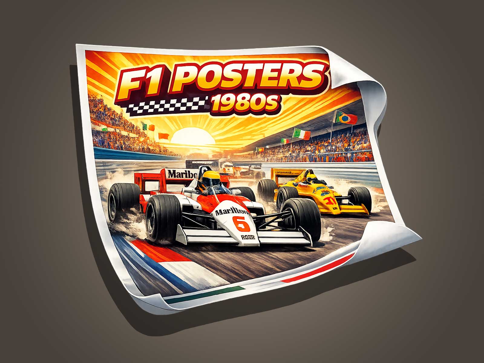
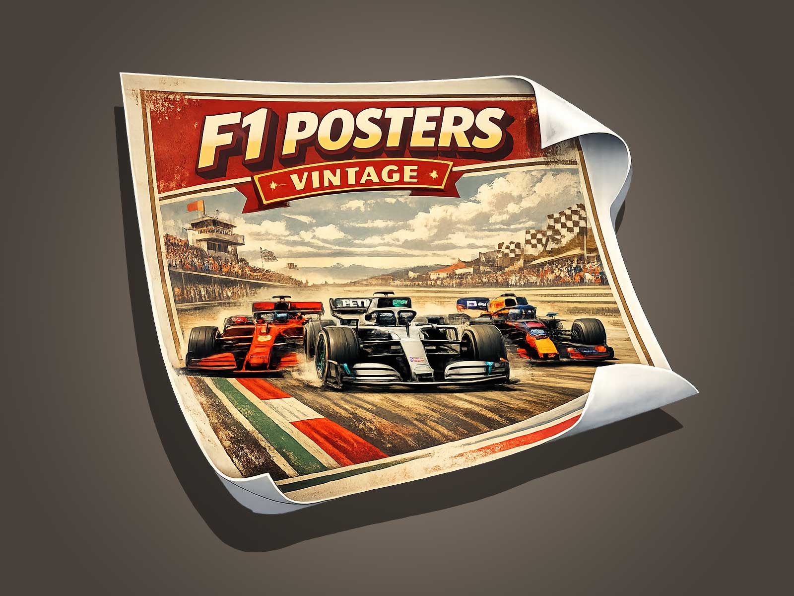
The visual language of a Tyrrell—sharp liveries, high-contrast color blocks and geometric shapes—does more than decorate a race car. When translated into a poster, those elements condense the speed, pressure and dramaturgy of a Grand Prix moment into a single, narrative-rich image. This article explains how contrast, composition and decorative intent combine to make a strong F1 race poster that feels kinetic and cinematic.
Why pop contrast captures racing intensity
High-contrast color palettes cut through visual noise the way a racing line slices through a grid. A Tyrrell’s bold colors and defined logos become shorthand for speed and identity on a poster. Contrast serves three practical storytelling roles: it prioritizes the car against background context, it amplifies perceived motion through directional color fields, and it creates emotional emphasis—highlighting elements like tires, airbrake wake or a halo of spray.
Compositional tactics to suggest motion and pressure
To translate a single instant of F1 into a poster that feels alive, designers rely on composition rather than literal depiction. Use diagonal axes to imply trajectory, crop tightly to suggest claustrophobic speed, and tilt negative space to convey lateral G-forces. Overlapping shapes and repeated lines can mimic aerodynamic flow, while exaggerated perspective—low viewpoint and foreshortening—makes the car feel like it’s charging into the frame.
Visual codes that keep the image decorative yet narrative
A successful decorative poster balances stylization with readable narrative cues. Preserve key Tyrrell identifiers (livery blocks, sponsor shapes, helmet silhouette) but simplify textures and details so the eye reads the scene at a glance. Apply selective detailing—sharp rendering on the car’s leading edge, softer treatment on background elements—to anchor focus. Decorative patterns (halftone fields, radial gradients) can stand in for smoke, heat shimmer or crowd blur without becoming literal.
Color and contrast as emotional levers
Color choices set the emotional temperature. Cooler background tones push the car forward when its livery is warmer; conversely, a cold car against a warm backdrop can create a sense of isolation and pressure. High-contrast rim lighting suggests sunlight or track reflections, increasing the drama. Use saturation strategically: a small area of intense color—on a helmet stripe or brake caliper—becomes the emotional heart of the composition.
Typography and layout: framing the moment
Type should complement, not compete with, the image. Minimal, condensed typefaces echo the mechanical precision of F1 and fit neatly into the negative spaces created by angled compositions. Position race information or a poster title along a parallel axis to the car’s trajectory to reinforce motion. Avoid heavy informational clutter; decorative posters succeed when the visual story reads first and the text supports it.
Practical steps for creating a narrative F1 poster
Start with a photographic or sketched reference to capture authentic posture and wheel angle. Block out large color shapes to test contrast relationships before adding detail. Use motion cues—speed lines, directional blur, layered shadows—sparingly to maintain clarity. Iterate at poster scale to ensure compositional impact from a distance, then refine small accents like reflections and edge highlights for close viewing.
The Tyrrell’s visual signature—clean geometry and bold contrasts—lends itself perfectly to narrative condensation. By distilling forms to their most graphic essentials, a poster can communicate the kinetic story of braking, overtaking or wheel-to-wheel tension without relying on photographic realism. The result is a decorative object that still carries the emotional and sensory charge of the Grand Prix.
Conclusion: turning a race instant into a lasting image
When contrast, composition and decorative intent are aligned, a Tyrrell-based poster can trap the sensation of speed, the squeeze of competition and the theater of a Grand Prix in one compelling frame. The poster becomes more than memorabilia: it’s a narrative snapshot that invites the viewer to feel the movement, sense the pressure and relive the drama of a single F1 race moment.
See the related F1 poster listing for a ready-made piece inspired by these principles: Formula 1 gift — F1 poster.