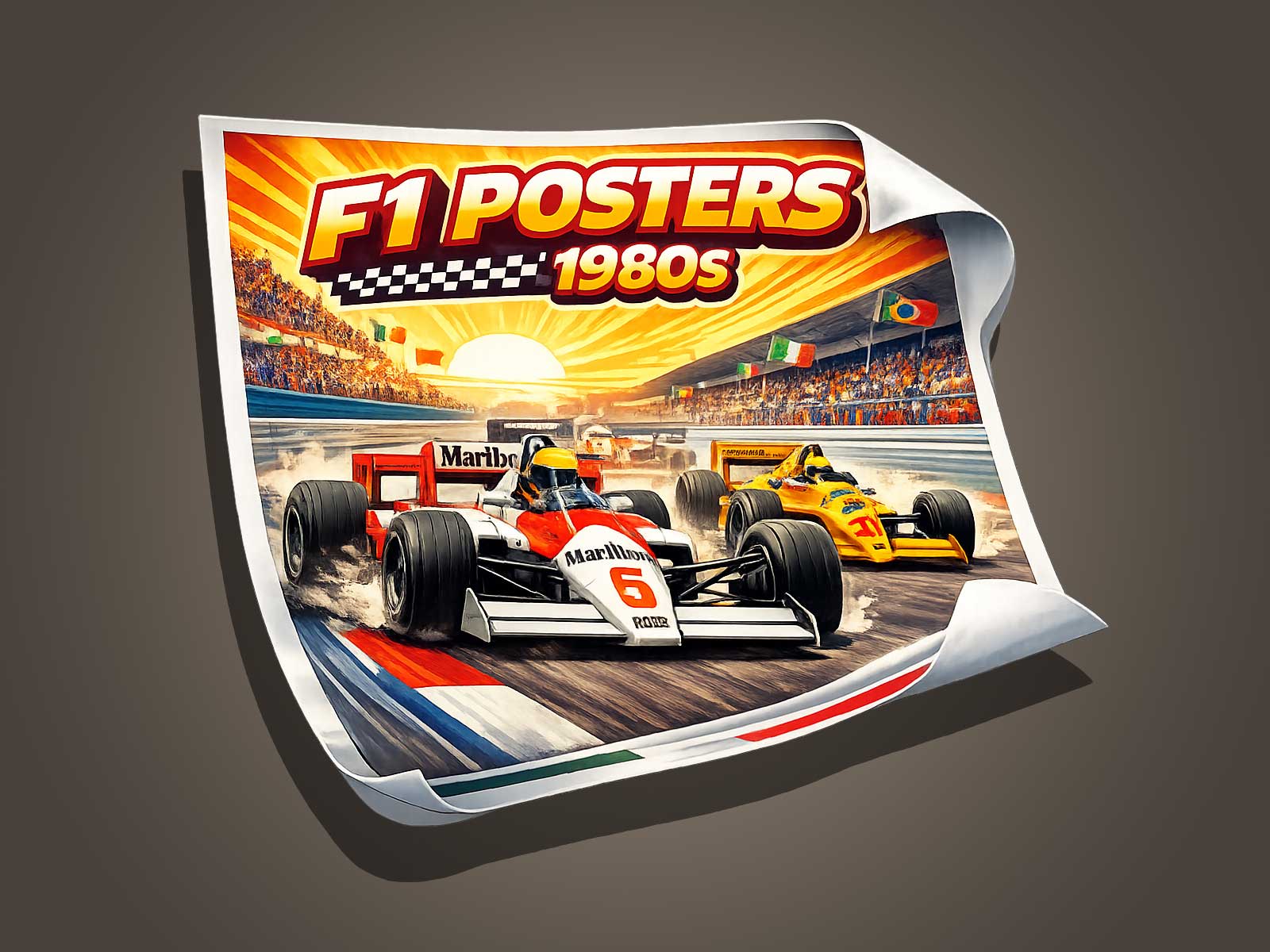
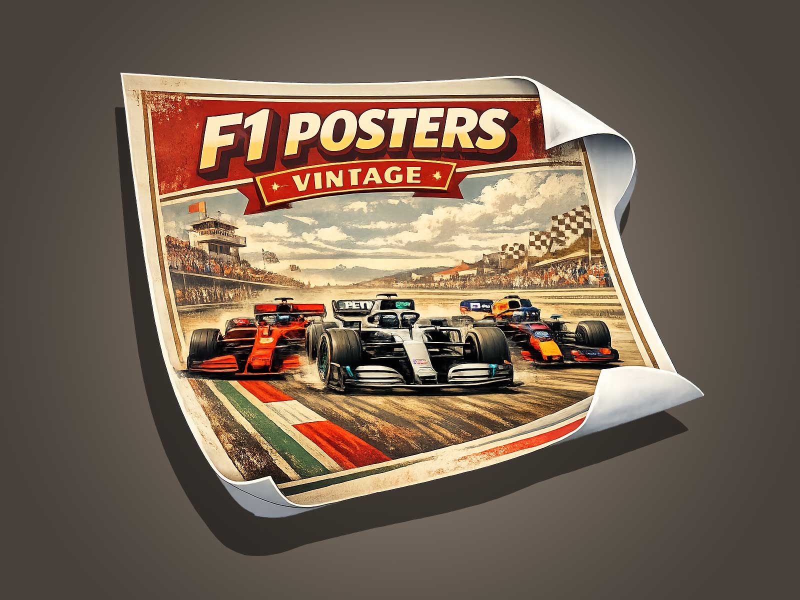
Scuderia Ferrari F1 is more than a racing team; it’s a visual brand that reads instantly from shape, color and motion. This article examines how Ferrari’s F1 cars impose themselves in imagery—through silhouette, livery details and compositional cues that convey velocity—helping poster and wall art designers capture that unmistakable presence.
Reading Ferrari by silhouette: distinctive shapes that read at a glance
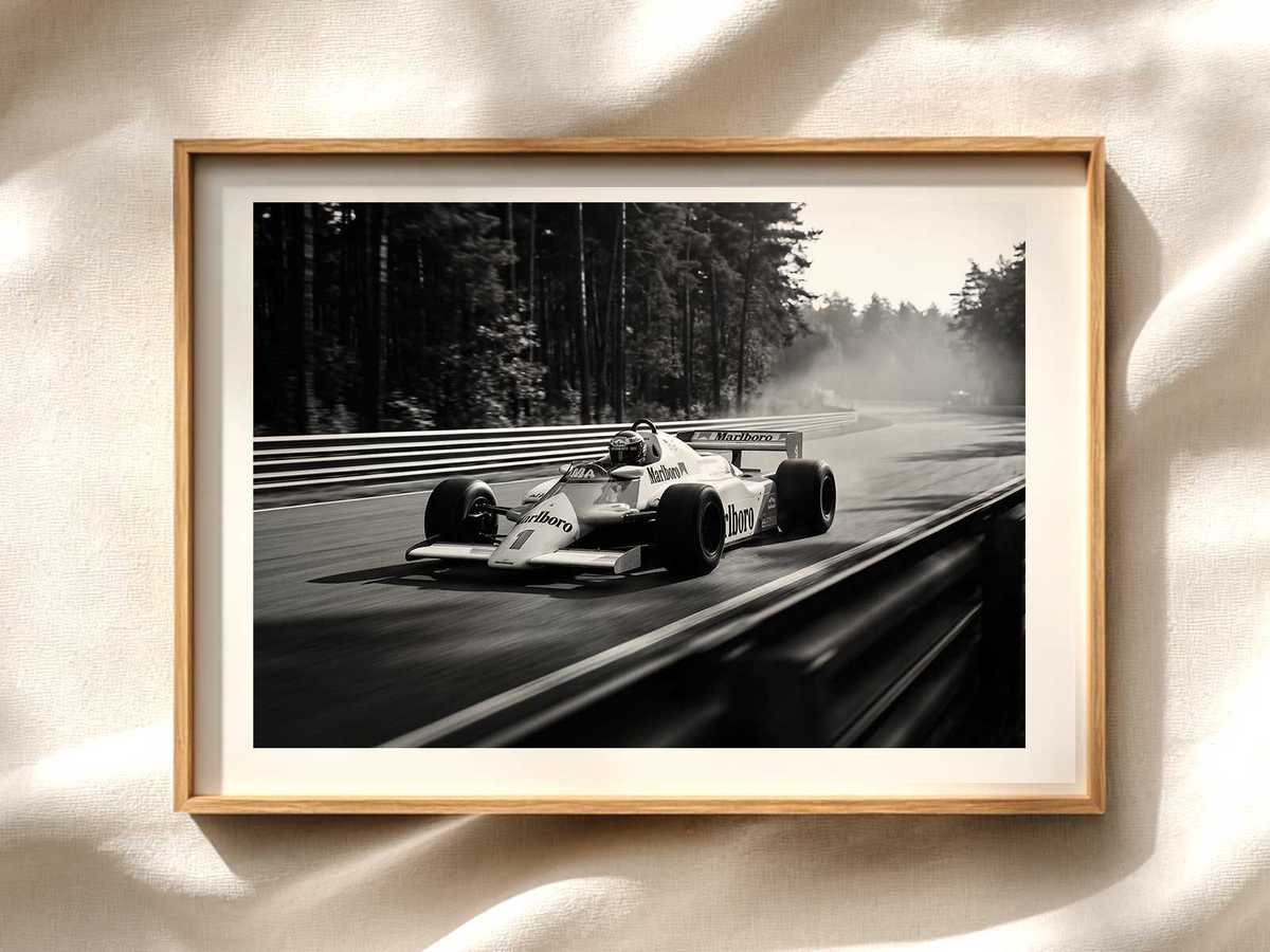
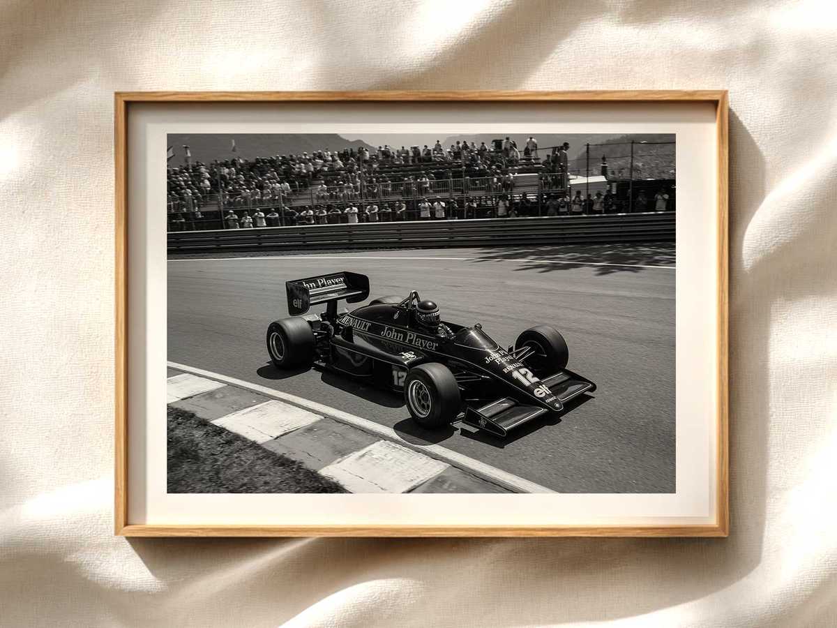
The silhouette of a Ferrari F1 car is a primary visual cue. Even at a distance or in low detail, the car’s proportions—low nose, sculpted sidepods, and a swept rear wing—create a recognisable outline. For poster design, isolating this outline helps the viewer identify the subject immediately without relying on badges or text.
Focus on the profile view or a three-quarter rear angle to show the car’s rake and wheelbase. These perspectives emphasize the car’s forward-leaning stance and mechanical drama. In tight crops, the negative space around the silhouette can accentuate the impression of speed and direction.
Livery as visual identity: more than just red
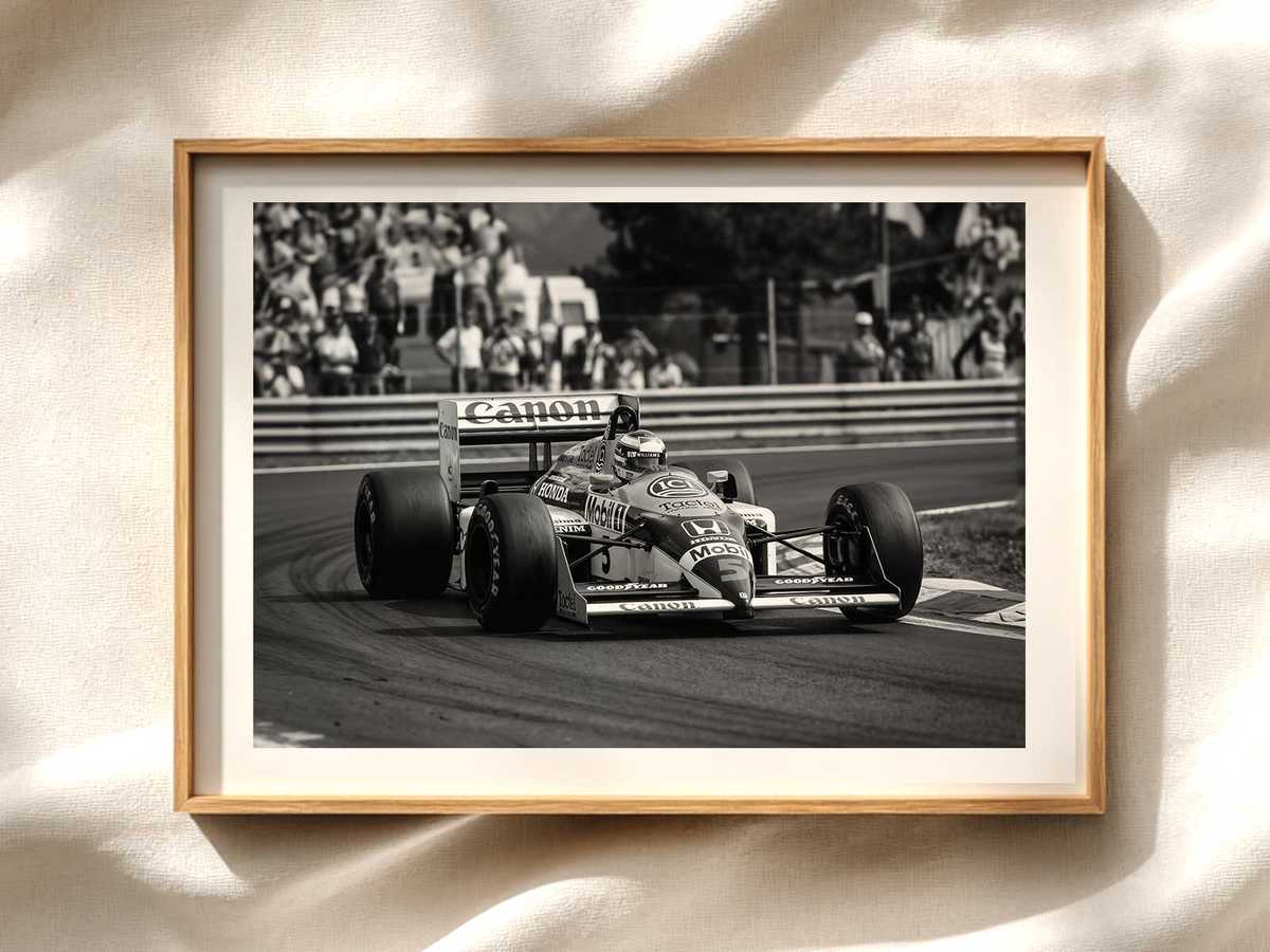
Ferrari’s red is iconic, but the livery comprises more than a single color. Contrasting elements—sponsor blocks, wheel rims, and aerodynamic appendages—break the plane of red and add rhythm. On posters, preserve the livery’s key contrasts: the red field, bright accents (yellow or white), and dark technical areas around the floor and diffuser. These elements create visual hierarchy and guide the eye across the car.
Textures and material cues—matte carbon, glossy paint, and metallic details—read differently in print and on-screen. When preparing artwork, exaggerating these material differences slightly can make panels and vents legible at poster scale without overcomplicating the image.
Conveying speed visually: composition, blur and directional cues
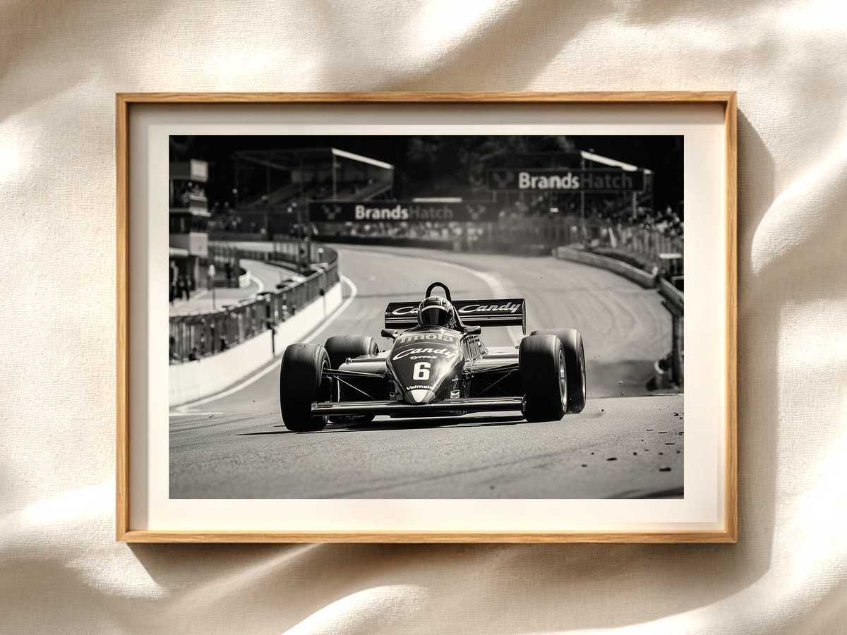
Speed is perceived rather than measured in static art. Compositional devices make a car feel fast: motion blur selective to the background or wheels, strong leading lines (track curbs, guardrails, or streaked light), and tilted camera angles that imply momentum. Placing the car off-center with more negative space ahead of it gives the impression of forward motion.
Light plays a role: specular highlights along the leading edge and streaks across the body suggest movement. For posters, using radial or longitudinal streaks—subtle, not overpowering—helps the brain fill in speed without reducing legibility.
Details that reinforce authenticity
Small, accurate details anchor a stylised composition in reality. Panel seams, brake duct shapes, and the halo silhouette are recognisable features that signal authenticity to knowledgeable viewers. Include enough technical detail to satisfy enthusiasts while keeping shapes bold and readable for general audiences.
Typography and insignia should be secondary. Let the car’s form and color do the work; place logos and type so they support rather than dominate the visual message.
Color balance and print considerations for posters
Red can shift in different media. Calibrate reds to preserve vibrancy without clipping highlights. Consider using a slightly warmer red in proofs to counteract common printing cool casts. Preserve contrast between the car and background: darkening the background behind the wheels and floor can increase perceived speed and weight.
Design tips for different poster styles
Minimalist: Use a high-contrast silhouette on a neutral background, with a single accent color pulled from the livery.
Photorealistic: Preserve reflections and material cues, add selective motion blur, and keep background elements simplified.
Graphical/Retro: Break the car into planes of flat color that respect the silhouette, using livery accents to create rhythm and movement.
Conclusion
Scuderia Ferrari F1’s visual dominance stems from a concise set of readable signals: a distinctive silhouette, a strong livery palette, and compositional cues that imply speed. For poster and wall art, prioritise these elements—clear outline, balanced color contrasts, selective detail and implied motion—to create images that feel undeniably Ferrari even before any text confirms it.
See related design inspiration and original posters on Etsy: Ferrari F1 poster (Circuit of America).