Miami’s vibrant visual language—neon horizons, pastel architecture, and balmy seaside glamour—takes on a new resonance when filtered through an F1 vintage aesthetic inspired by the 1980s. This article examines how reinterpreting Miami as a motorsport poster subject emphasizes visual memory, historical patina, and cultural value. We look at design choices that evoke film grain, faded color, and period typography to create posters that feel both nostalgic and archival, and we explain why collectors and interior designers value that layered heritage.
Why Miami and F1 Pair Naturally in a Vintage Poster
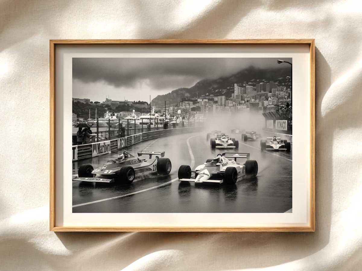
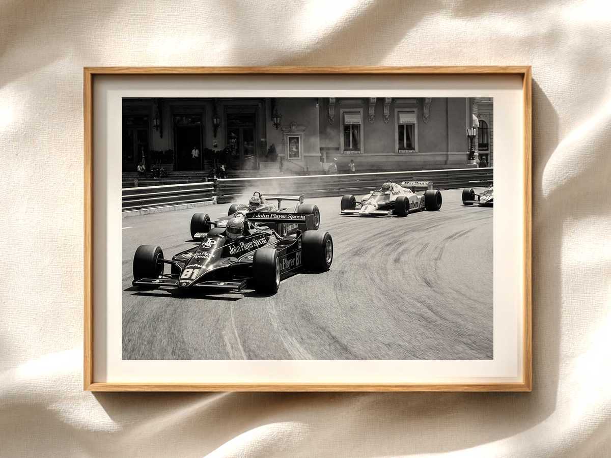
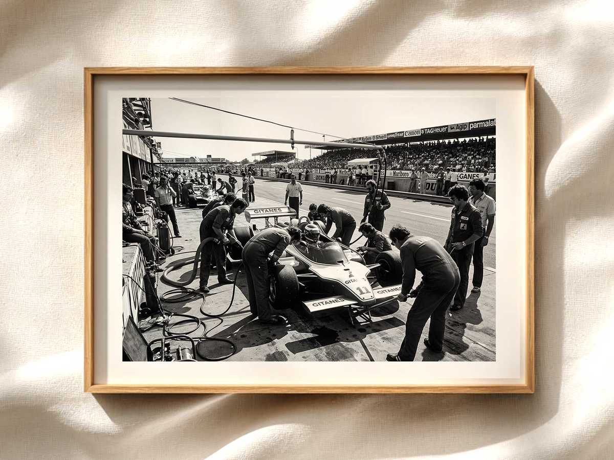
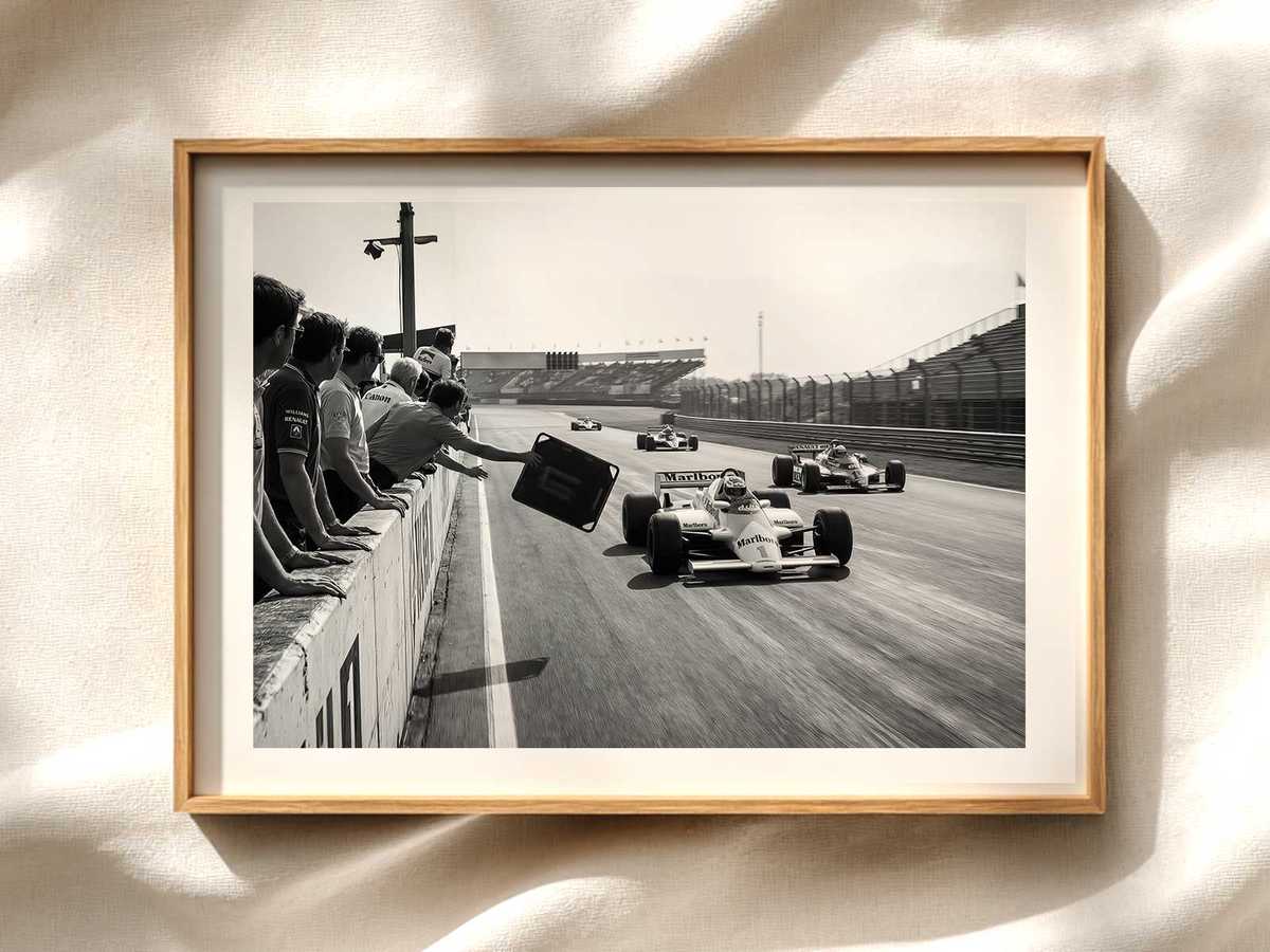
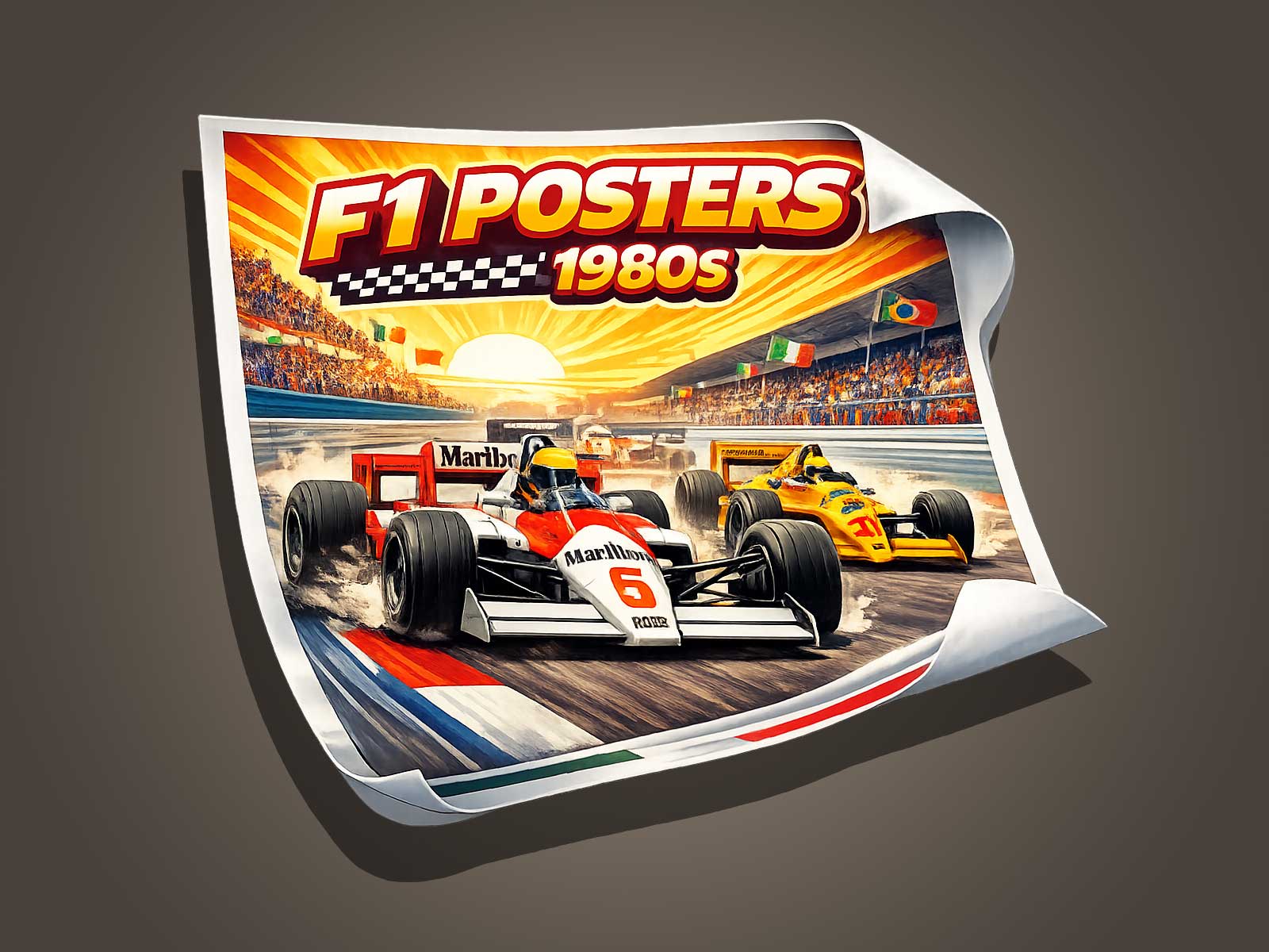
Miami’s imagery is already cinematic: palm-lined boulevards, art deco facades, and sun-splashed waterfronts. Overlaying that with the speed, glamour, and technical drama of Formula 1—especially through a 1980s lens—creates a powerful visual juxtaposition. The 1980s were a formative period for both motorsport marketing and Miami’s global pop-culture identity. Designers borrowing period cues—such as high-contrast halftones, duotone washes, and period-correct logotypes—make the city feel like an authentic backdrop to a bygone era of racing, even when the subject is contemporary.
Memory and Visual Patina: Techniques That Suggest Age
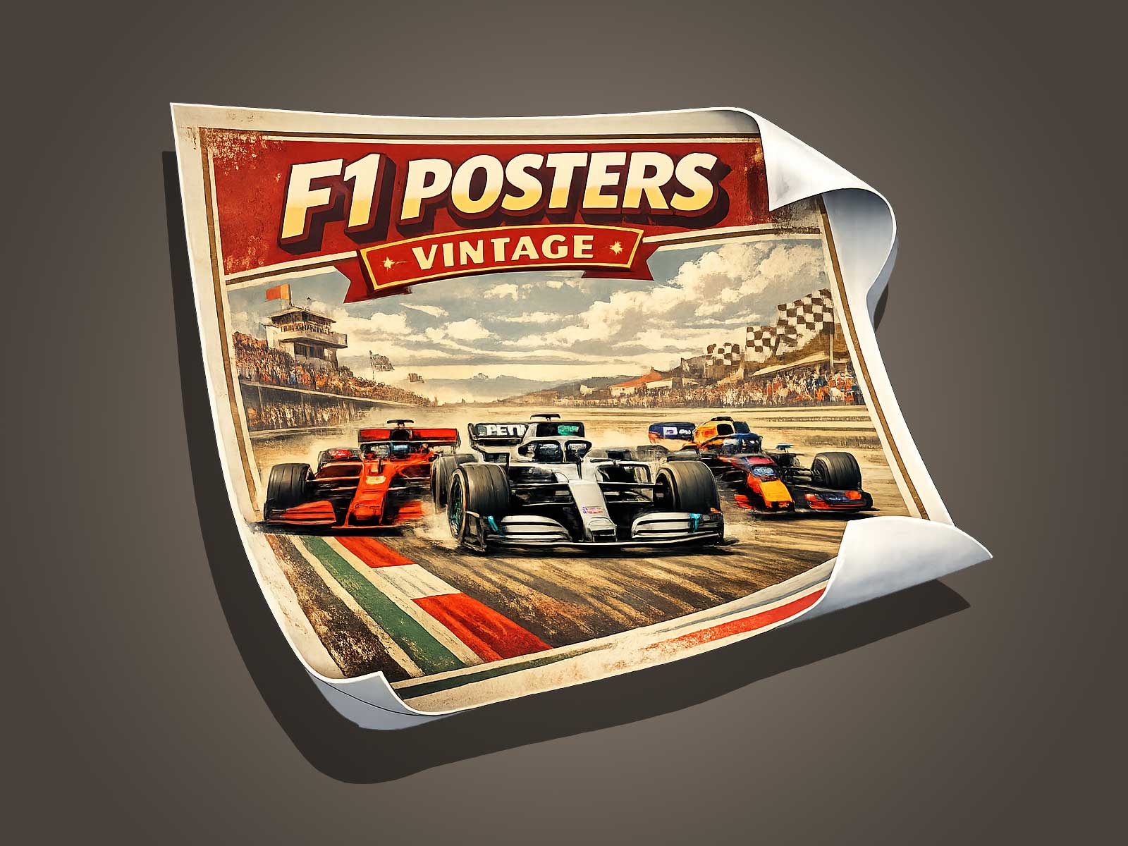
A convincing vintage poster doesn’t simply copy retro motifs; it simulates how images accumulate history. Visual patina can be introduced through subtle texture overlays that imitate paper grain, scuffs, and sun-faded pigment. Color grading that pushes teals toward cyan and warms skin tones subtly into salmon or peach replicates dye shifts seen in old prints. Film-grain noise and light leaks add authenticity without compromising legibility. When applied thoughtfully, these techniques trigger a viewer’s sense of memory—making the poster read as an artifact rather than a reproduction.
Compositional Choices That Echo 1980s Motorsport Posters
Designers working in a vintage F1 idiom draw on specific compositional strategies from the era: bold geometric framing, eccentric negative space, and dynamic diagonals that convey speed. Incorporating schematic elements—blueprint lines, grid overlays, and simplified car silhouettes—recalls technical posters and program covers from the period. Type choices matter: condensed sans-serifs and stylized display faces with condensed x-heights evoke period advertising, while small caps and letterspaced credits mirror race programs and event posters. These elements together make the poster read as both a design statement and a documentary object.
Heritage Value: Why Collectors Care About the ‘Look of Age’
Collectors prize posters that appear to belong to a history because they offer a narrative: a connection to a place, a time, and the sensory culture of motorsport. A well-made 1980s-style Miami F1 poster functions as a mnemonic device—prompting associations with sun-soaked circuits, grand prix glamour, and period media. This perceived authenticity enhances emotional value and marketability. For interior settings, these posters are prized for adding character and storytelling to modern spaces, where the patinated object becomes a focal point that contrasts with sleek contemporary furnishings.
Practical Advice for Designers and Collectors
Designers: prioritize restrained aging. Subtlety sells; over-applied effects risk pastiche. Start with a solid composition and apply texture, color shifts, and type treatments in layers, testing prints at target sizes to ensure the patina reads correctly in the physical medium.
Collectors: look for posters with consistent print quality and archival materials. A poster that intentionally simulates aging should still be printed on durable paper with lightfast inks if it’s intended for long-term display. When buying online, inspect close-up images for texture fidelity and check seller notes for paper weight and printing method.
Case Example: Reimagining Miami Through an 1980s F1 Lens
Imagine a composition that places a simplified Formula 1 car silhouette in the foreground, its lines rendered as high-contrast halftone. Behind it, a pastel gradient evokes Miami Beach at dusk, layered with an art-deco skyline rendered in a limited palette of coral, teal, and warm cream. Small typographic credits in a condensed sans-serif anchor the bottom edge, and a faint paper-crackle texture unifies the plane. Such a poster reads simultaneously as a design homage and as a cultural relic—capturing both the glamour of motorsport and the layered memory of Miami.
Where to Find Quality Vintage-Inspired F1 Posters
Specialist shops and independent printmakers often offer limited-run posters that embrace archival techniques and museum-grade paper. When possible, review seller listings for details on print run size, paper stock, and whether the piece is signed or numbered. The combination of thoughtful design and transparent production details indicates a poster created with heritage in mind.
Conclusion
Reading Miami through a 1980s F1 poster aesthetic deepens the city’s visual legacy by adding layers of memory, patina, and cultural value. The most successful pieces balance authentic period cues with contemporary production standards, offering both the emotional allure of nostalgia and the tangible quality collectors expect. For designers and collectors alike, this fusion of place and motorsport creates posters that function as decorative art and as curated fragments of visual history.
For a related example and to view a vintage-inspired Formula 1 poster, see this Etsy listing: https://www.etsy.com/listing/4446187248/formula-1-poster-formula1-wall-art